
Concept Work - Halloween 2025
This concept work took place at the start of my Multi-Channel Marketing apprenticeship with Rubies. I think it’s important to share what my creative process looked like at the time, as well as reflect on what I might do differently now, having had two years to develop and process what I’ve learnt throughout the course.
The Brief
The brief was to create a Halloween campaign for 2025 that would appeal to all audiences and could be used across both generic and licensed costumes.
My Approach
I started by using visual research to explore potential colour schemes — looking for colours that could work across superheroes, horror and princess costumes, while still catering to a broad audience. When cross-checking against previous campaigns, I noticed that green hadn’t been used in recent years, which helped influence my direction.
Imagery & theme - As I analysed my moodboards, I started thinking about what kind of environment could bring superheroes, villains, the undead and princesses together in the same space. This led me to the idea of a Carnival, where a diverse range of characters could naturally exist alongside each other. There was also a recurring trend within retro graphics that I felt could support this idea, helping to create a bold and playful visual style while still fitting the Halloween theme.
Text & Logo - Sticking with the circus theme, I chose typefaces that felt retro and could be paired well with the Rubies logo. For the final logo concept, I took inspiration from a carnival ticket, using this as the basis for the shape and overall design.
A concept video was conducted to show how the imagery could work within a campaign.

Where can this concept go?
Website - Expanding the concept to the website, I liked the idea of using the slogan “Choose Your Circus”, as it fitted well with how the costumes were already categorised within the system. The customer could essentially choose what they wanted their circus (or home) to be — whether that was undead, medieval, fairytales or superheroes.
Dream vs Nightmare - Acknowledging that the Halloween range is a mix of superheroes and villains, I explored the idea of giving customers a choice between two bundles: The Dream and The Nightmare Bundle. The Dream Bundle is characterised by pink and purple imagery, featuring a range of costumes from the enchanted, hero, western and regal sections. The Nightmare Bundle uses the original green imagery and focuses on costumes from the horror, sorcery and undead sections.
I think this concept could work beyond the bundle idea, with the campaign slogan “Will You Dream or Nightmare This Halloween?” The pinkish-purple and green colour palette creates a visually appealing contrast across the website, while providing a simple way to split the wider Halloween range into two distinct themes. This still allows customers to explore different costume categories within each theme, without making the range feel too restricted.
Refining the concept
After a marketing meeting, we found that retro and neon were the key trends to follow for Halloween 2025. Anime style was also mentioned as a potential trend opportunity, which appealed to me as a way of introducing a sketch-like aesthetic into the campaign.
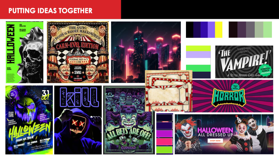
The experimentation began by introducing neon colours and playing with different patterns in the background. The colour schemes were inspired by anime shows, as well as Hazbin Hotel and Helluva Boss, which both incorporate circus themes and make strong use of neon colours.
The Final Concept
I enjoyed this concept thoroughly and was glad to experiment with four different styles throughout the process: image-based, surrealism, vector/screen print and anime.
This wasn’t the chosen campaign, but looking back, my personal favourites would have to be the top-right and bottom-right concepts. The top-right combines vector elements with imagery to create a surreal appearance, but I think there is too much happening visually, which causes the text to get lost.
In comparison, the bottom-right concept has stronger contrast and feels more inviting, encouraging the audience to explore Rubies. However, I think the arrows could be improved — rather than pointing towards the Rubies tent, they would be more effective if they directed the audience towards the Call to Action button.


Comments