
Week 9- Message Delivered
- Tramaine Berry
- Nov 17, 2020
- 10 min read
Updated: Sep 21, 2023
Lecture //

Sam Winston is a fellow dyslexic designer who is known for his typography and his curiousity with how language carries messages and their visual forms.
I found it interesting how he was talking in the lecture about how designers have a habit of thinking about the outcome, which made me think about the project 'a delicate sight' and how sight makes us precious about our work. Another interesting factor is outside distractions that disrupt the creative process such as mobile phones or other forms of visual language, allowing him to pay attention to his other enhanced senses.

I absolutely love this drawing! It makes me feel as if I am staring into the Abis. The is a lot of energy trapped in the same form. This reminds me of the static movement you sometimes come across in the dark.
This project first came about when he was drawing with a blindfold and he liked the feeling of not knowing what or why he was drawing and drawing from the gut.
I wonder how he was able to live in the dark for a month though. Did he stock up his living space with packaged foods? How difficult was it to shower or find his toothbrush? Did the lack of light influence his sleeping pattern? Then again, I am reminded of how pirates wore an eye patch so one eye was immune to seeing in the dark.
I think the main challenge is doing nothing, especially in today's era. We are so used to having our visual senses stimulated and our working lives expect us to live life at a fast pace, we are not used to embracing boredom or slowing down. I wonder if living like this would make it easier to process an idea? Winston mentions that he sees the darkness as a blank canvas and makes you feel vulnerable because you are giving up a primary source of information and stop being a visual consumer.

The main theme I am receiving from the resources provided to me is 'where do ideas come from?'. Before this week, I was under the assumption that ideas were generated from our environment, which is what Sarah Illenberger suggests in 'smile of the mind'. I can see where Winston is coming from when he cancels out primary information because some of my best ideas come when I am trying to sleep (in the dark). John Gorham suggests that ideas can be made whether unconscious, subconscious or conscious, however, original ideas do not come from the conscious because it reuses information. It makes me wonder what state of mind Winston was trying to activate. On one hand, you have no primary information to go on and forces you to rely on your subconscious. On the other hand, does the mind automatically wonder in the darkness to long-term visual memories? Could sitting in darkness alone be a form of meditation? To have a sense of inner focus? Being alone in the dark triggers the subconscious, which is a state of present awareness.
After Psychologists Anna Steidel and Lioba Werth conducted a series of experiments with lighting and concluded that darkness triggers a 'chain of interrelated processes'. This makes me wonder why light symbolises creativity. Maybe to symbolise that you no longer need to be in the dark once an idea comes?

Steidel and Werth suspect that dim lighting nudges our minds into exploratory mode and bright places are restraining to the thought process. However, brightness does enhance the reasoning process, which Dr Carson suggests can be destructive to our ideas, which is why it is important to control this through thinking caps; thinking caps allow a set time were we are able to focus only on one mindset at a time such as reasoning, allowing us to come up with things that can go wrong in a particular idea.
Will Hunt explains in his book 'Underground' that once we are cut out from the constant stream of visual stimuli, we start making up our own based from the images stored in our memory. Marietta Schwarz, a German artist created a project called 'Knowledge of Space, which involved wearing a blindfold for 22 days. The main objective was to study the blind. She reported hallucinations of abstract patterns and her visual cortex lit up as if she wasn't being blindfolded.
How our eyes do and don't work
Will Hunt's exploration of how our eyes work leds me to question whether lighting influences the colour (or lack of) that we see and whether we are really seeing everything that nature has to offer - are our eyes acting as a filter or are they automatically colouring in a black and white world?
According to BBC, Rod cells allow us to see in grayscale in low-light conditions. Additionally, the term 'aphakia' is brought to may attention, which is a condition that allows people to see ultraviolet vision. Claude Monet had the lens on his left eye removed at the age of 82, giving him the ability to see (and paint) in ultraviolet.

Another eye condition is 'tetrachromacy, which is a gene that influences the development of the retinas and enables them to see invisible colours, which is enhanced in dim lighting (lighting that would reduce our vision to greyscale). Concetta Antico is an artist and art teacher, and she describes paint as a medium that allows her to show everyone the colours no photograph can capture. Oil paint in particular is favoured due to the concentration of pigments.

Guest Lecture - Anthony Burrill
Anthony Burril is best known for his typographic letterpress posters. His work is inspired by events that have already happened or the things he has personally experienced.

This project is about Austrailia's wildfire, which uses coal from the fire to create the print and donated all proceeds towards rebuilding lives and restoring Austrailian wildlife habitates. I love how he uses medium to make a strong connection to the event, and the simplicity of his type is very beautiful. I would like to experiment with this concept of using medium that is strongly and emotionally connected to a place or event.
I have always been more enthusiastic with the concept rather than the medium or process, however, I think the fact that he uses medium to create a social impact changes my viewpoint because it makes the concept stronger and its very emotive. I can see myself exploring medium in this way.

This project is a miniture book that is filled with a collection of posters he has produced. Each message he prints is his own words, which have been inspired by his own life experience or/and a result of a conversation.
Workshop //
In the dark, I was contemplating this week's workshop and trying to find out how I felt about the town I live in, which I haven't given much thought into before. I refer back to this week's lecture asking 'what is it about this town that is unique?' and 'why do you live there?'.
My initial thoughts:
Moving to Falmouth was the first time since dad's death that felt like home. But why? Could it be the type of people there? The sense of community? A sense of belonging? The fact that it is a small beach town like my last home? Does this town resemble my personality?
Stressful due to the lack of jobs in Cornwall
I refer back to week 4 to see if my personality is how I see Falmouth because I think this town has influenced aspects of my personality.

Thoughtful - Small business in Falmouth come to mind.
Principled - Trends of veganism in the university. Sustainability in businesses and community beach cleans.
Friendly - The people I live with currently and have come to know at my undergraduate.
Emotion Theory
Robert Plutchik's Theory

Trust and Joy are the two of the eight emotions I can identify with the town I live in.
Book II of Aristotle's 'Rhetoric'
Friendship & Kindness
Feelings List

Aliveness/ Joy
Courageous /Powerful
Tender
Accepting/ Open
Out of all of these words, I think 'accepting' is the right word in terms of how much I have absorbed Falmouth's culture and the friendships I have created.
Chosen word: Welcomed
'Welcomed' has been chosen because I thought it would be a better alternative from 'accepting' in terms of visual opportunities.
Ideas:
My research looked into how lighting can change perception, so what if I used natural light as a medium? What does welcome mean in lighting?
Present or previous flatmates have always been there to help me feel welcomed. When I first came to Falmouth, they introduced me to their friend groups and encouraged me to be social. And even in lockdown my current flatmates encourage social activities such as bake-off, beer pong or a game of cards.
Gift Basket: Things from local shops or the marketplace like jams or baked goods. What if the word was spelt in local jam? A starter pack of items inspired by my 3 years as a Falmouth Student?
Greeting Card
Banner
Concept 1: Flatmates
Beer-pong typeface

People typeface
Cake/ icing type (Bake-off sessions)
A game of cards (one card could have 'welcome')
Welcome mat - misspelt as 'welcome mate'

Concept 2: Lighting
'welcome' stencil with sunset background
Could record an audio of welcoming background noises and then draw in the dark whilst listening to it.
Christmas lights in Falmouth - rearrange into 'welcome'
Falmouth flags stenciled
Falmouth lights at night (no sure if any would be on during lockdown)
Concept 3: Passing on information
This is inspired by my flatmate concept and how each person gives you a fresh piece of information. For example, first year flatmates built up my knowledge of music artists. This also reminds me of how as a student ambassador during my BA degree, I would talk to prospective students about the hightlights of Falmouth as a university and as a town, so maybe this could be a design branded for the University or Student Union.
A survival guide on being a Falmouth student.

Or maybe a guide to a future flatmate regarding information about current flatmates, favourite flat activities and problems with the house that they should be aware of.
Maybe it can be a banner hung up inside the new-comer's room as a surprise!

Cafe banners...locals can write down highlights of Falmouth or experiences on banner
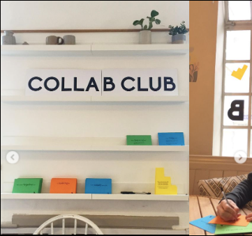
This idea reminds me of 'Doorstep Cornwall' due how they encourage creative students to collaborate with each other. Last year, they added a stand inside Huddle Cafe in Falmouth, which gave people the opportunity to hang up cards asking for collaboration opportunities.

I like the idea of collaborating and getting people to add something to a piece of work because it's a great way of making someone feel 'welcome', and I think this is what I was trying to communicate when talking about my flatmates; the feeling of being connected or participating in community.
Concept 4: The town
Seagulls
Seaside
Fresher's events
Marketplace
Community meet-ups like cafes
Accents
Look at local news and see if I could use materials inspired by an event.
Town's colours - reminds me of a printer. Overlapping colours.

Lesley Moore
I came across this collection of posters, which I thought would be a great inspiration for my cafe banner idea.The concept behind this project washow the mood in a cafe-restaurant shifts during the day, from concentration with laptops in the morning to the buzzing of friends in the evening. I would like to play with these different moods exploring the many ways Falmouth makes me feel welcomed.

"Good design is not about style, but is a number of formal decisions based on an original idea"
I found a quote by Lesley Moore, which I thought I would record because I was curious about what style actually was in week 10's research.
Lesley Moore is an Amsterdam-based graphic design agency, founded by Karin van den Brandt and Alex Clay in 2004. Their approach is very minimalist and they believe that form derives from concept, a belief that reminds me of Ophelia Ford-Welman in week 10.
Chosen idea: Collaboration Project
I am going to ask people living in Falmouth: 'What is your favourite feature in Falmouth is and what about it makes them feel welcomed/ at home?'
This primary research will be conducted across social media platforms due to the restrictions of lockdown. Using this data, I will create patterns similar to Lesley Moore except these will be inspired by comments from Falmouth locals.
Comments:
PG House - an abbreviation for my flat (1)
The marina / harbour (1)
The maritime museum (1)
Pendennis Point (2)
Seaside (1)
Kimberly Park (1)
Cafe community like Beacon (1)
Seven Stars, a local's institution (1)
Highstreet / Small businesses (1)
Fox Rosehill Gardens (1)
Student Community at Falmouth University (1)
The moodboard below is a collection of Google Images (lack of time to collect own), which are the favourite places recorded on the survey. I am using this to inspire the colour palette for each location on my info-graphics.

The 'student community' was a bit vague, so I've created a moodboard full of memories from my student experience. Student union's brand came to mind when considering the colour palette due to how closely linked it is with my memories.

Using the data from the survey, I have created an infographic that allows people to see which places in Falmouth made them feel most welcomed.


I feel that the masked statistic needs to have block text because the unmasked version feels more stable and fun-loving. The thinness of the masked type has feels too harsh with its contrast.
Additionally, I think I could have shown the colour palette options for each location to make it clearer on my colour decisions.
My new book arrived! TypoLyrics: The Sound of Fonts
Looking into my new book, I noticed a piece of work that resembles my card game idea for concept 1.
The typeface being used in this piece is called Adhesive Mr.Seven by Roland Hormann, which takes the blackletter typeface out of its historical context with contemporary tools. It was a concept for an Austrian creative economy magazine, however, this was rejected since Fraktur-related type still provokes Austria.

Idea:
What if my patterns were on playing cards. 'Welcome pack...of cards'
What happens next?
Due to lack of time, I was unable to carry out my original idea of creating patterns inspired by the survey's most welcoming places in Falmouth. I have turned Lesley Moore's patterns into cards to illustrate what my final piece would have looked like if I had more time. The idea of the 'welcome pack of cards' solidifies the idea of how participation/collaboration creates a welcoming environment within Falmouth, which also encourages people to come together.

If I were to improve this info-graphic, I would add more spacing in-between the 'Welcome' and the bullet points. I would also use a grid that suited the lines in the block-like welcome. And I would have liked to have explored the colour palette a bit more by looking at the emotion each location creates or by turning the sounds of each atmosphere into a colour. This reminds me of a painter I looked at in week 7, where the artist had the ability to see sound and recorded it using abstract oil painting.
Discussion //
FEEDBACK //
I liked the banner idea, it would have been nice to see it developed
I like the colours
Need to tie elements together into real world context - a guide or map
REFLECTION //
This week was challenging because I wan't sure what the right word to use was, especially during the pandemic. I would have liked to to come up with a finalised idea, but I excited with the development of the workshop so far because of how the spirit of collaboration has captured, which is the very reason why I feel welcomed. I would have liked to have asked participants to submit their interpretation of their favourite places, however, I don't think the range of different styles would work in one piece and I wouldn't have had as many participants involved; I deliberately submitted a short and simple question due to the convenience of the participant. Although, I could have arranged an online workshop but this would have required more time for planning in advance.
I have noticed that I tend to backtrack to this week because I am exploring more designers and noticed a few that would help inspire a development for my week 9 workshop.
References //
https://soundcloud.com/wcncast/93-a-delicate-sight-max-porter-sam-winston
https://www.youtube.com/watch?v=706cGnjT44Q&feature=emb_logo
https://www.youtube.com/watch?v=R-ogoWe9Quc&feature=emb_logo
A smile in the mind; witty thinking in graphic design. Beryl McAlhone, David Stuart, Greg Quinton, Nick Asbury & McAlhone, Beryl & Stuart, David & Quinton, Greg & Asbury, Nick. Phaidon Press Limited
https://www.fastcompany.com/3020888/why-creativity-thrives-in-the-dark
https://elemental.medium.com/darkness-can-do-all-kinds-of-things-to-your-body-and-brain-beb3d0da2fb4
https://www.popsci.com/sensory-deprivation-effects-darkness/
https://www.bbc.com/future/article/20150727-what-are-the-limits-of-human-vision
https://www.bbc.com/future/article/20140905-the-women-with-super-human-vision
https://www.tate.org.uk/art/art-terms/p/pop-art/anthony-burrill-letter#
https://www.smashingmagazine.com/2014/01/anthony-burrill-work-hard-be-nice-to-people/
Typo Lyrics: the sound of fonts. Edited by Slanted.


Comments