
Week 6- Noticing the ignored
- Tramaine Berry
- Oct 29, 2020
- 9 min read
Updated: Sep 21, 2023
LECTURE //


Matsubara uses elements of urban landscape for clothing design. He reminded me of my Art & Design Foundation course in 2016 because I was required to explore different elements of design including fashion. The project i was doing involved taking architectural patterns and turning then into textiles, and because I was adament I wanted to go into Graphic Design, I wrapped my textiles around a 3D typeface. I can't seem to find it in my files but I'll have to ask family members whether my old sketchbooks haven't been thrown away. Below is a rough idea of what it looks like.

WEBINAR //
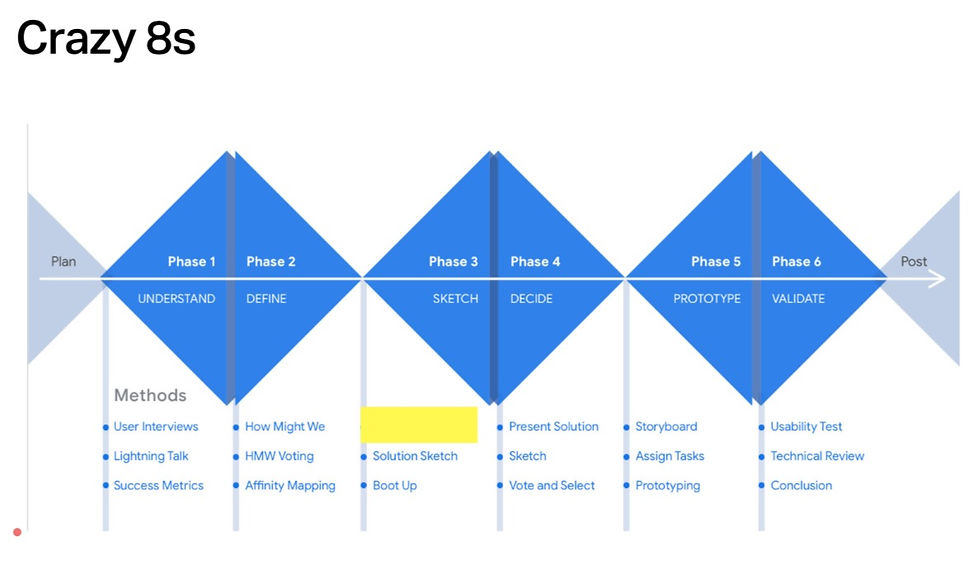
Crazy 8s is a fast sketching exercise that challenges people to sketch eight ideas within eight minutes.
Defne Stage: What is Graphic Design?
Problem Solving
Making someone smile
Communicating a message
Typography
Editorial
Grids
Image & Type
Animation
Impact (could use the 'Impact' Typeface)
Brand & Identity
Web Design / Digital Platform
Software
Ideas
Sketch Stage: Graphic Design monogram

I found the webinar workshop overal very stressful because as a dyslexic, my cognitive processing is slow. The first idea was mentally visualised as I was making my notes, and then when the timer started I had trouble coming up with a second idea (see blank space).
The first idea represents how I value creating a smile, so I made a monogram in the shape of a smiley face. The Seventh idea was a development of the first idea, however, it didnt end up being an improvement because the lettering has become completely unrecognisable. Another person in my group had the same idea as me, however, instead of adding teeth and circles for eyes, she added a small vertical line inside the G to act as another eye. I like this concept because it is simpler, so it will be easier to mass produce as well as making it easier to recognise the monogram as letters.
The third idea looked into the idea of thinking outside the box. I liked one idea that Hannah Zennel had whn she enhanced the monogram GD and placed a small square on the outskirts, which places more emphasis on the lettering with more legibility.
The fourth idea represents how graphic design solves problems, so I used the equals sign and placed the letters inside to symbolise how graphic design supports this idea; the letters almost act like the walls to a building. This idea also shows how much weight is placed onto this subject when it comes to problem solving.
The fifth idea is a grid of 3 by 3 with the letters inside. The letters do not take up all of the grid because as a designer I believe in negative space. I like how the letters are moving away from each other so its almost playful. I would have liked to use only one square of my 3 by 3 grid for each letter (half their height) because I remember how Chris Do in his YouTube criteques talked about how its important for assets to be no larger than a third of your grid; it allows the type to move around and the assets can breathe.
The sixth idea is a thinking bubble with the letters GD inside. I would have liked to make the cloud in the shape of the letters. And the eighth idea looked into how elements are placed together to form something else. I was also referencing this idea from the fourth square because I liked the idea of graphic design being refered to a maths problem. The overlapping shapes also look like a jigsaw puzzle.
WORKSHOP CHALLENGE //

This week's workshop is about noticing the ignored. Becuase Falmouth's weather has been raining all week, I decided to use my shopping day as an opportunity to capture anything that interests me on my usual route. I find that this was different from how I usually see this route because I always walk with purpose and never go outside unless I need to, so this gives me less reason to divert from my path or look anywhere besides ahead.
The first selection of photos represents a single street. I was interested in the neglect within the street and this was when I was encouraging myself to look up or around the corner from where I was standing. The first photo is an image of some leaves on someone's roof because I've never seen that before. The second is an image of plants taking over someone's pathway. The third is the space inbetween housing with graffetti at the side, which reminds me of how police take pictures when they are on their patrols. The photo below is a facebook post of a graffitied building near Woodlane Campus, Falmouth. I find this interesting because these posts are giving me insight on what is going on near my town as well as pecieving different reactions/ attitudes from the posts. I first came across police patrol photos during our first lockdown in march, when sightenings of social distancing rules were not being followed in beaches and parks.


This selection also represents a single street, which as you can probably tell, involved more curiosity than the later images. The first few images are of the berry bush becuase I was interested in the fence and how you are unable to see what is beyond it despite the transparency. I was also interested in the berries becasue it makes me wonder whether consumerism has made us forget about the tradition of foraging. It reminded me of the summer when I forgaged for wild garlic. Makes me wonder what would happen if a typical grocery sign would make them more noticeable.


For me, the bare branches represents time and made me wonder where the time went between now and the start of Covid-19. I also liked the bareness of the branches becuase it looks neglected.
The large dent on someone's car reminded me of Daniel Eatock's collection of cars and his description of how each unpainted repair was like a story. This piece was inspired by Japanese Kintsug, which places more value on the object before the repair.

And after looking at 'Simulations: If the River were a road', I was very interested in the cable lines and how they act as a design grid. I was interested in the numbering on the cable post and what they mean. According to Lorri Trewhella, this telegraph pole tells us that it is owned by BT, is 9 metres in length and was produced in 2002. Still not sure about the last two digits though.
This piece was from 'Designing Design by Kenya Hara. Hara is a university teacher in Tokyo, who has asked his students to make something known, unknown i.e, the Shimanto River. I like the idea of unknowing the world we see everyday because it is invoking curiosity and creating a new perspective.

This street was a bit of a detour from my usual shopping route because the amount of textures and lack of maintenance caught my eye. It looks like it's the rougher side of Falmouth. It's different from other streets because they are open and friendly, whilst the wooden doors make you feel unwelcome and you are unable to see the front door. It makes me wonder how they recieve their mail. This street contains litter, graffeti and vegetation is coming out of the walls.


What if I were to take this abandoned furniture and repurpose it. Reminds me of my flatmate becuase he has beautified and reused a desk and a draw for his room.

I like how someone graffitied 'SLOW' for the 20 zone. Makes me wonder whether this person was angry at people not following the sign. Because this road is known for being student based, maybe the locals thought they needed to educate the students for their driving tests.
Chosen Street: King's Avenue
Concept 1: Signage and Auto-pilot mode

This piece looks into value. It responds to our consumerist society and how we don't tend to notice things unless there is a sign. This also makes me question whether signage (tourism, roads, etc) has made us less curious about our world; I am certainly guilty of only taking purpose-led routes. This reminds me of Kenya Hara's concept of making the known into the unknown.
To develop this further, I could find ways to use signagage as a way to distract people from their unconscious mindset (autopilot).

This piece is an idea for switching off auto-pilot mode, which uses a bright yellow line as a way of grabbing attention and intriguing people to move away from their current route. The photo was taken from Google Maps due to bad weather.

My ential thoughts revolved around the idea that even in an unconscious mindset, people always stop at a traffic light, creating plenty of opportunities to observe their surroundings. And due to the fact that this is a neighbourhood street, there is no need for a traffic light, which led me towards the idea of a zebra crossing instead.
Other thoughts on the traffic light idea involved using the colour amber because it symbolises being aware without needing to stop what you are doing, which is seen as important in today's fast paced world.
Then my thoughts drew onto how people tend to look down when crossing a zebra-crossing, so I thought of using a reflective surface that will allow pedestrians to see a fresh perspective (the sky). To develop this further, I would need to figure out what material would be unbreakable when cars approach and then attempt to mimic a realistic surface.

This project reminds me of the Fun Theory, which promotes good behaviours through fun. The video below shows a promotion of exercise by transforming the staircase into a piano.

Concept 2: Electrical Lines

I noticed that the cable lines have the same amount of lines sheet music has, so I decided to add some random symbols. I could have chosen more specific music that suits how I would describe the street. To develop this further, I could turn this into a video so musical symbols will move along to background music. Might also be better to capture this scene in the dark so the lines can be emphaised in white.

As an extention to the sheet music concept, I transformed the electrical lines into instrumental strings to a violin. To develop this further, I could look at other forms of string music and see how I could incorportate them into this photo. To improve this piece, I could phtoshop a real violin stick into this photo instead of creating it from scratch because then it would look more natural in the photo, and it would also suit the situationalist movement.

I came up with this idea as I was taking my knitting break. It is a life sized version of a pin and yarn map used in detective or crime films. To develop this further, I could make the pin look less like a glowing lamp, and work on the lighting of these assests so it can blend into the image.
This reminds me of Carl Warner's surreal landscapes due to how he compares everyday landscape with everyday objects such as food, and turns an existing world into a completely new one. Carl Warner enjoys making imagers from things that most people would not take a second look at such as the contents of his own fridge or materials from building sites. To develop this idea further, I could try to remake the entire street using everyday objects.


Concept 3: Personification

I was interested in the resource that Julia Holla shared because it reminded me of how children personify everything. I used to think cars had eyes and didn't notice the person driving it.
Vanyu Krastev produced the image displayed below. He has a series of photos that transforms faulty objects into humourous characters. I feel like both me and Krastev have similar attitudes because we both love using our skills to brighten someone's day.
'The goal is to humilate the streets and the enviroment to give sunny and warm emotions to the passing people'
Additionally, I think this solves the problem I was facing with my first concept, which was questioning how people would be able to turn-off their auto-pilot mode when they are taking walks; these googley eyes are random and something that is new within the everyday environment, so is likely to draw attention.


Above is an example of how I used to see cars. To develop this further, I could transform more objects on my chosen street. I like the idea of making the work visable to the public rather than editing on Photoshop because then it would allow me to test my theory on switching off the unconscious mindset, as well as brightening a gloomy day for people. However, photoshop allows me to animate objects further without restrictions.
DISCUSSION

Feedback

Development

This isn't my final piece but it was a happy accident whilst I was making it; it looks like a skating ramp. Below is my final piece.

REFLECTION //
This week, I feel that I was a bit light on my research because I would have liked to explore more on the unconscious mindset and how design has been used to influence positive behaviour. Additionally, I was also interested in the aspect of play and how it influences the creativity process, which would have been good to research during the design process last week.
I feel that this week started off slow due to the bad weather, however, this week has allowed me to consider the different ways to approch the project in terms of whether the project looks into how I see the world or aims to change someone else's behaviour. My favourite concept is the mirror surface for the zebra crossing because it is inspired by observations of myself and my attitudes towards my walks, and influencing behaviour in a way that effects people's health and wellbeing is something that I am very interested in as a designer.
The ideas wall was a very useful resource because I was struggling with finding resources for this week. I think this is something I need to improve on by looking at the list ofdesign blogs provided by the course leader; it would give me an up-to-date insight on today's design trends rather than relying on designers I have seen in the past.
RESOURCES //
John Berger / Ways of Seeign- Episode 1 (1972)
Sketchbooks: the hidden art of designers, illustrators and creatives. Richard Brerton, 2009.
Ex-formation, 2018. Kenya Hara.
https://www.youtube.com/watch?v=2lXh2n0aPyw&feature=emb_logo
https://challenges.openideo.com/challenge/mayo-clinic/inspiration/the-fun-theory


Comments