
Week 5 - Written Communication
- Tramaine Berry
- Feb 19, 2021
- 25 min read
Updated: Sep 27, 2023
This week is the start of the second brief called Visual Writing. The objective is to explore the relationship between written context and form : type spec, layout, colour, materials, navigation, format, pacing and ton of voice.
My research will explore the output of authors and publishers within the visual culture, allowing me to recognise and develop my own tone of vioce. I am dreading this brief because writing is my weakest area, but I think this will show that I am capable of challenging myself.
WHAT'S NEW?
Good things come in 3s!
New Job
I have been offered a 6-month contract as DMALINK's Marketing Executive! Just need to wait for the funding to come through for the kickstarter scheme.
I have even been asked to write a success story due to how short a time I was seeking help from my work coach - honestly don't know why I didn't do this sooner.
Results for Underdog Competitions x2
Due to the founder of the stu.dent platform not knowing what they want for tone of voice, they had decided to cancel their request for a logo. Whilst this is frustrating to hear, the Underdog community has chosen the winner and runners up with a certificate.
There are some things I would have liked to change about this logo such as the length of the arrow. Maybe the letter 't' could have acted as the arrow - just play around with the position of the bar. Or use the semi-circle for the end of the arrow so it follows the same geometric shape as the letterforms.


Side Project Idea
I was thinking of keeping a journal/calender to record the things I notice about my dyslexia. For example, there was one time I thought alcohol made my dyslexia worse, but what if it does the opposite - what if it blocks my dyslexia and stops me from making connections for idea generation?
It took a whole week to recover from a recent flatmate's birthday, I wasn't hungover just fuzzy headed. There is't much research on the effects of dyslexia and alcohol but there have been discussions within the creative dyslexia community about how some people drink alcohol to quieten the mind and stop overthinking. This would explain my frustrations during week 4.
Side effects of overthinking:
Frustration over how slow your idea generation is when sketching on paper, which is why my idea generation is through typing and the better ideas are sketched when I want to develop something further (methodology found at the start of this module yay). This brings me back to my process mentioned in the workshop challenge - typing is a way for me to think fluently but its temporary on memory, and anything I write on paper are the ideas I want to develop (physical is permanent, digital is temporary).
Unable to sleep or switch off - I tend to keep my phone handy so I can message myself ideas and read it in the morning.
Mental health - as mentioned in my diary entry, overthinking during lockdown is exhausting and causes stress migraines.
You enjoy a clear head during idea generation - again difficult to know when your mind gives you permission to sleep haha.
Fatigue- Caffeine is your new best friend. Although a caffeine crash usually happens 30 mins a day, so enjoy the nap.
Indecisive on what topic to choose- last week's problem (only cure is time and zero alcohol)
RESEARCH //
Lecture
This Lecture looked into what drives artists and designers to write about visual culture. Manifestos encourage opinion regarding society, design and politics, which started off in 1914 at a time of unstable politics, which acted as a springboard for Supremism, Futurism, Cubism and Russian Constructivism.
Futurism
Flippo Tommaso Martinetti - Futurist founder and poet
France was regarded as the centre for traditional arts, which was rejected by futurists; past culture was seen to weigh down the future.
Futurists were against sadness, which was characterised through their avoidance of greys and browns. They were even against pasta (interesting but odd fact), which represents sluggishness - it reminds me of the sluggish aesthetic used by surrealist painter Salvader Dali. I think there is a conflict between Futurism and Surrealism because they both present an escape from the cruel reality of political climates, but Futurists are action-based (technology and industrial is the new beauty of speed) and Surrealists stay in the present and drag their feet as it were (daydreaming and making time stop).

Surrealism
Yves Tanguy - writer
Vorticism
The equivalent to Futurism through the use of industrial imagery.

Blast Magazine - Humorous writing style with a vitriolic tone. Placed emphasis on the unconventional rhythm of the type layout.
De Stijl
Reduction of form and colour, which was a rejection of Art Deco and Art Nouveau's decorative nature. I enjoy Art Deco and Art Nouveau due to how they use nature to inspire their designs, however, I also appreciate the simplicity of geometric forms and I think the limitation of colour applies to today's branding industry; enables the viewer to not be too overwhelmed or distracted from the content.
Swiss Style & Modernism
I found it interesting how Neue Grafik doesn't refer to history visually. It's weird to see a publication that deliberately goes out of its way to ignore creative expression, which has been achieved through its neutral type, repetitive layout, and using photography rather than illustration. I do understand why photography is more informative than illustration though, photography doesn't select what aesthetic details to leave out....or does it? There are special camera lens to create illusive effects and you are able to filter and blur the background.
Below are examples of illusive photography. One has used reflection to play with perception, which has been flipped upside-down for a surreal effect. The other one uses either motion or a blur tool to create distorted forms. From what I can see from these examples, illusive photography would have existed during this movement due to how these photos do not appear to have any filters.

Vilmos Huszar - letter design

Die Neue Typographic - rules of type
Tschichold
Swiss Style (International Typographic Style introduced modernism to the world
Emil Ruder - Ideas through writing. Principles included: culture, natural sciences, politics and societies of all times and places. Focused on legibility rather than style.
Paul Rand - Thoughts on Design
'good design is good will' and 'thoughts on design' books.
It's interesting on how he talks about how the number of strips on his IBM logo represents the value of the product and a version of the logo with 13 strips if much more lighter. Could he be more playful with the variations of strips? Maybe the number of strips for a product could act as a system for knowing the price range - 13 strips for lowest price in-store for example. Half price offer halves the number of strips?
Writing style: Simplistic type. short, vivid and playful illustrations
Octavia
2986-1992 typographic magazine
Collaboration
2014 Collector's Edition: Innovative Packaging and Graphics invited artists to draw directly onto the cover of a standard edition book, which raised £6,000 for Alzheimer Society.
Adrian Shaughnessy
One notable figure in the field of graphic designers who write is Adrian Shaughnessy, a designer, author and lecturer who started his career as a partner at Intro graphic design studio.
Co-founder of Unit Editions. Mix of historical (relevant to today's audiences) and contemporary books. Made by designers for designers.
graphic design is being automised in its process. Left the studio and started publishing books. Adapted to online book publishing. Supergraphics terminology.
'How to be a graphic Designer without losing your soul'
Mentioned social designers, Johnathan Barnbrook and Nicolas Blechman. Other resources mentioned was underconsideration.com and designobserver.com
Tone of voice- He points out that designers have humour and wit because they come from a place of observation. But Adrian's writing style isn't witty or humorous. He bases the advise he makes through own experience, which is written as if it were a blog - written in the way he usually speaks. One thing I did notice was tha he doesn't say 'I think', which shows that he has put research into what he is saying- something I need to develop in my own writing style. Like me, he also uses dashes in his writing, which indicates a sense of spontaneous writing and thinking.
He also uses metaphors to create references and provides useful resources for the students reading it, and it is also used to make up for the lack of imagery so readers can create a mental picture of what the writer is talking about.
Pacing- You can see on the cover how he uses dashes excessively, which is a visual reference to the resources he provides within the book.Slashes also indicate a line break and disrupt the flow of information, perhaps to signify the barriers the author has had to overcome. Slashes are often used in poetry, although these are always invisible unless coding is involved. Maybe this visual language is suppose to represent the 'secret recipe' or code of success to life after graduation?
Themes- He seems to have turned the front page into a content page, which is either to give people a sneak preview of what's included or to stick with the theme of resourcefulness. Colour theory suggests that the book is filled with wisdom, truth and intelligence.

The layout- seems to vary throughout the book, but consistently uses bold blue type to highlight key information or to add additional information onto a previous paragraph. To increase legibility as well as maintaining attention span from lack of imagery, the paragraph changes its position and width when the one-sided conversation has drifted into a different topic. He uses a modern minimalistic approach to this design, which is appropriate as he contextualises his advice for the modern world - perhaps the layout itself is a guideline for students on what editorial design looks like in today's industry. Helvetica has been used to create a neutral but friendly tone to the book, contributing to the modern aesthetic.

Craig Oldham
Very excited to hear that there are design books surrounding social issues such as 'in loving memory of work'. This is definitely an area that I want to write about, I just need to analyse whether there is a range of ways to write about this and how they are presented.
I found it interesting in his 'Its Nice That' interview, he describes design as a middle class profession. I wonder if the current political climate will make design lower in class. And whether it is harder for lower class backgrounds to start in this industry - is it because they can't afford beautiful magazines or packaging?
Honesty tone of voice - 'Oh Shit what now' book
In Loving memory of work
Born 10 days after the 12 month strike ended. Largest industry in the world. History influences his political views. Family generation of miners. 1 year without a wage – no benefits because he was on strike – handouts from neighbours. Dad was imprison for 3 years for fighting for his job. Powerful strike moment captured as police was about to hit a photographer. Women campaigned even when Thatcher was expecting wives to bring the men back to work – raising money and used colours from suffrijets.
Media manipulated footage and photos to make it look like the miners were in the wrong.
Design is Middle class? People campaigned, used others work to inspire their own, and made banners using shed paint. Collaboration of work with the same message, following the theme of community and solidarity.
To tackle the 'middle class' stereotype of the design industry, Maric Cumber founded The Accumulate Art School for the Homeless in 2015, allowing the creative homeless to move forward in their lives with a scholarship for people wanting to go to university. This is also an interesting insight into the struggles, causes and experiences people have gone through, creating an emotionally raw tone. The collaboration involved shows a similar solidarity as Oldham's book, however, there is less anger in comparison and mix between sorrow and hopefulness. And the individuality is very consistent in the book, giving the reader an emotional connection with the visual and written personalities.


Back to Oldham's book. The only worry when publishing his book was whether he was representing people in the right way (including family). I found the tone of voice in his presentation off-putting due to his use of language, however, I think he does this deliberately to represent the harsh reality of a historical event and /or to place emphasis on his passion for the subject. If his use of harsh language were a typeface, it would be the one used in his front cover with its sharp edges and detached aesthetic.
I was surprised after listening to his presentation how formal his writing is due to how angry and passionate he was. His writing sounded like a news report, although he wasn't even born during this time - maybe due to how all the newspapers were against the miners, sparking this urgency to write one that finally supports them.
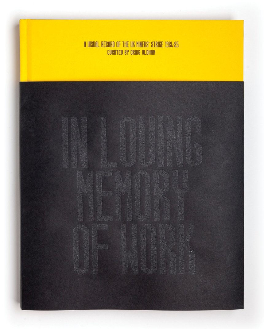
The typography shown on the front cover has been used throughout the book. There have been other editions but still continues to use the same type, although this particular piece is my favourite due to how he prints with the coal used on the old mining site. It reminds me of Anthony Burril's Austraila bushfire poster, however, Craig claims to be inspired by Andy Warhol's diamond dusting and Darren Coffield's images made from coal. According to his Creative review interview, the density of his medium was difficult to brake-up and tore the silk screen prints once hardened, so he needed to work fast as well as concentrate on the ratio of glue, paint and coal.
Andy Warhol borrowed the diamond dust method from Rupert Jasen Smith, which was used to enrich the surface of his paintings.

Darren Coffield's exhibition on Ashes and Diamonds examined the miner's strike during the 1980s, which uses coal from the mining site in his paintings.


Liaison typeface is used throughout In Loving Memory of Work, which was inspired by Liaison Committee for the defence of the trade union (the miners themselves). The geometric forms shows the industrial nature of mining, containing kinks in its Ks and Hs to emphasise the harsh but direct nature of individual voices.
TOC (2011) Anna Gerber and Britt Iverson, Visual Editions: Part Revolution, Part Reinvention, Part Making it Up Along the Way
A book full of holes – layered text. Reuses another book and challenging conventions. Visual Editions Publishing. I think the tone of voice they were aiming for is to challenge people's perception of what is normal.
Other books that try to challenge the viewer's perspective is 'what it's like to feel dyslexic, by Sam Barclay' and 'a dictionary story, by Sam Winston'. Both designers are dyslexic with the aim of informing audiences how they see things, although both have different approaches.
Sam Winston's book focuses on how he interprets language as a dyslexic and the whole book acts as an individual project He mentions that a dictionary is filled with all the words you need to say, therefore it is a story in itself. His book explores the connections between words and the new images they create. He uses a letter press and Baskerville type to keep the traditional theme of the dictionary.


In contrast Sam Barclay uses his own experiences and research to bring viewers into the written world of the dyslexic community; although effort has been made to improve reading abilities, little has been done to create understanding of how it feels. Through research and experience, I know how learning difficulties are still misinterpreted as being of low intelligence, so I think the aim of this book is to spread social awareness.
I love how he plays with language! He uses two words with the same spelling within the same sentence, which brings me back to my school frustrations and makes me question further why the English language has to have so many meanings: I am content with this content. The meanings behind our words have adapted to the many cultures through history such as, the vikings, romans, Shakespeare, Latins, Germans, and the French - new languages sieve into one.
He uses capital letters in some of the layouts because these are more difficult to recognise by some dyslexics, which is why he has deliberately condensed the letterforms to make it harder for non-dyslexics.


Rejane Dal Bello - Citizen First Designer Second

Rejane's book talks about our role as a designer within society but also includes a chapter on living with dyslexia.
Why do designers write books?
Based on research and discussion from the Ideas Wall, I have curated a list of reasons for a designer to write their own book.
Advise on how to start
Different pathways - not all designers have a degree
Changing trends in the design world and its history
Immortality via book or to act as a portfolio. work-promotion
To talk about a project or the values of the designer
A reminder not to make the same mistakes
Something original to say about visual communication
To challenge the normality people live in.
Spread awareness
Materialising a thought process
To intrigue the collaboration of others
To create a budget for research
To capture a moment (event purpose)
I think a book also makes it easier to collect information and collaborate with others. There is something about this format that sounds more official and immortal that makes people more eager to participate in.
What is tone of voice?
The personality we communicate
Language (visual and written)
Values
Consistency across digital and physical formats
Knowing your audience
The difference between how you want to sound and how you sound to others
Comparison with competitors
Authenticity and creditability
WORKSHOP CHALLENGE //
Tone of voice category?
First things first manifesto - It holds the same values as me. It would be interesting to see what other manifestos have similar viewpoints because this was too obvious a choice for me.
A diary or speech- Based on the research I have been doing, I like the idea of speaking through someone else's voice.
A news story- I like the idea of basing an editorial on an event but I've never been someone that likes to read the news due to how impersonal it is; you only hear how the middle-man interprets information and there isn't much personality.
Even though a diary might not hold key information, I love the human-side to it and how you can see the story teller's personality. Although, I was surprised after listening to his presentation how formal his writing is due to how angry and passionate he was. His writing sounded like a news report, although he wasn't even born during this time - maybe due to how all the newspapers were against the miners, sparking this urgency to write one that finally supports them.
Manifestos
First Things First
Counter-Culture - rough trade books are dedicated to this movement
News Story
Speech
Diary
Writing a journal via mobile during journeys to work.
Drag Queens during the pandemic with no rights to furlough and struggle to adapt to the new digital landscape.
https://www.bbc.co.uk/news/newsbeat-55650668 https://www.bbc.co.uk/iplayer/episode/p0955xfs/rupauls-drag-race-uk-queens-on-lockdown
Stories about Covid, describing what they miss https://www.bbc.co.uk/news/stories-55936729
My Tone of voice
After looking at news articles they all had one thing in common - they made me fall asleep (literally). I put this down to my dyslexia processing information but also the slow pace involved.
I would like to create a mix between a diary and a news story, creating a more engaging tone of voice with all the facts to back-up the one-sided stories. In doing this, there will be a lot of creative potential from a visual point of view as well as speeding up the pace of the writing and making it dyslexia friendly. Other things I need to consider for this piece is to use tinted paper, lowercase lettering,
In the diary section is a collection of quotes on how Covid has affected them. I really like the idea of collaboration, so maybe I could also collect some data from the course as well specifically from part-time students. This reminds me of a data collecting website where people enter a word to a question and the infographic shows the most used word through proportion.
Survey
To create content for my editorial, I have created a survey for the course to describe all the struggles they have been though. I intend to include my own entry to make a start on visualisation. I also intend to do some research on events that have been occurring during this time and whether there are any articles on part-time students specifically; part-time students only get a loan for tuition and business failures are resulting in job loses and financial struggles.

My own diary entry:
This year has been very emotional. I started off last year with the intentions of securing a job before graduation and preparing for this course, however, the economic climate left businesses not having the funding for in-experienced designers. I was left living on my savings and struggling to find a job that pays for the work you do. My mental health was affected during my studies, I felt utterly useless and unmotivated. My savings started to run out and my family were far away and not in any position to accept an extra person in the house. I tried to apply for Universal Credit, which at first was declined because they classed my course as full-time - I even broke down in tears a couple of times at the thought of dropping out of my course just to claim benefits. I'm in the process of being accepted into the kick-starter program and I've won a design competition, but this year has been so hard that I can't stop feeling cautious that this is all too good to be true.
Responses:


Articles: Pandemic and Part-time students
Students in France wait for food handouts as COVID-19 destroys part-time jobs.Manuel Ausloos, 19th February 2021. https://www.reuters.com/article/us-health-coronavirus-france-students-po-idUSKBN2AJ1DO
UK unemployment rises to 5.1% as Covid lockdown freezes economy. Phillip Inman, 23 February 2021. https://www.theguardian.com/business/2021/feb/23/uk-unemployment-rises-covid-lockdown-furlough-scheme
Covid: Support calls for graduates in 'midst of pandemic'. Rachel Flint, 13 December 2020. https://www.bbc.co.uk/news/uk-wales-55222388
A student getting into trouble for claiming benefits - even though he was a full-time student looking for full-time work, I can relate to how hard the lockdown has been and there were times I had even considered dropping out to claim benefits. This would be a good first layer for my diary entry. https://www.stokesentinel.co.uk/news/stoke-on-trent-news/law-student-cheated-state-out-5025045
Students Enrolled Part-Time Are More Likely to Stop Out. Madeline St. Amour, 5 May 2020. https://www.insidehighered.com/quicktakes/2020/05/05/students-enrolled-part-time-are-more-likely-stop-out
Idea generation
Take an article and annotate it with diary entries - so the formality of facts can be connected to the personal. I think this would also keep dyslexics engage in the content due to the change in narrative and dynamic layout. These entries would interrupt the flow of information being received - almost like a pause button to allow the dyslexic mind to process the information.
Vulnerability - writing my first diary entry has challenged me to become more vulnerable, which doesn't come natural to me. The real challenge lies behind the urge to reframe from talking about the emotional side, which I think would be an interesting concept for interacting with the content.
Maybe the diary entries need to be peeled back or scratched to reveal a secret. 'penny for your thoughts' - a coin included in the book to scratch out diary entries.

Maybe invisible ink to indicate how feelings are hidden in the darkness, hidden from the eye of others.
I really liked how Irma Boom uses holes to print her content, only making it visible through certain angles and unviewable through digitalisation.

Morse code? Maybe this code be the visual identity across the whole book. Could have morse code as the top layer, which would be scratched off to translate the code.

Cocooning. Maybe this book could be a sculpture or pop-up book, which would have the diary entries wrapped up in its cocoon. This particular image below has an interesting pattern like the packaging for oranges, maybe I could overlay each entry with this protective cocoon. The art nouveau movement comes to mind as I consider the link between nature and objects. This also brings me to packaging - that's a form of cocooning in itself, so what if the article was the front with entries inside?

This also brings me to packaging - that's a form of cocooning in itself, so what if the article was the front of the packaging with the entries inside? I like the idea of connecting the subject of Covid with grocery items due to how essential they have become (psychologically) over lockdown; during Christmas advertisements were reassuring their customers that its okay to treat yourself since its lockdown, suggesting that there has been a significant rise in shopping for comfort.

An advent calender! Instead of the chocolate, there will be folded up diary entries inside with the article in the front. The viewer is able to choose their own pace - they can read the whole article at one or peel back a section of the article as they read. Could make the idea of a Christmas Calender more relevant by researching articles that were dated during everyone's first Christmas in lockdown.

A big packet of filters for cigarettes - the diary entries can be made to look like filters to symbolise the filtering nature of handwriting. The article would be on the front of the packaging. The connection smoking has with Covid is the urge to reduce stress as much as possible during these hard times, yet science suggest smokers being on the vulnerable sector for the disease.

Newspaper articles could be on the exterior of the building, covering and keeping the interior hidden from view. The thought came to me when I was thinking about glass being something that protects you but also isolates you from the outside world, which also reminded me of glass cases. Moving onto my idea, the interior would have a wall of diary entries, a bit like Patrick Thomas' installation for 'Breaking News'.
Due to the lack of natural lighting, artificial and harsh lighting would need to be used. This is very relevant to our environment during lockdown and how we have been restricted from going outside for leisure and enjoying the sunlight- I know you are allowed to go out for exercise but you cant sit in the park and the shock of the pandemic affects mental health, which makes it difficult to maintain essential activities. The interior would need to be divided into the size of bedrooms in order to create the similar tone of voice from the diaries through atmosphere.

Envelops or hidden pouches within the pages- inspiration was the back of my notebook. The article could be on the top with diaries hidden behind each page - or maybe there could be secret pages where you need to unclip or seperate by force. Magnetised pages? However, I am worried this wouldn't increase the pace of the actual article.

What if the scratch layer were the article and you would need to read the information before scratching it out and recieving the diary entry - this article would be split up into seperate sections so there can be a pause button on how much information is being absorbed. This would be the type of book that can only be used once due to the erasing of the news article sections - its a bit like how normal newspapers are only read once but has the ability to be reused for a different purpose - in the book's case it would be a collection of personal entries rather than a news story. Additionally, the idea of stopping the reader from the ability of returning to a text they have read symbolises my own experience as a dyslexic because I either forget about the information and move on with the next thing, or I will type something with the reluctance of back-tracking due to the length of time it will take me to refresh the information - if I really need to remember an idea I usually write it down in my sketchbook, the blog is a platform where I type fluently as I think due to how slow I am with handwriting.
Webinar: Essay Master Class
Ben Evans James mentioned how the format of a project influences the idea generation, which contracts with another lecture from last module; Ophelia Ford-Welman talked about how ideas shouldn't be driven through format. Ben also suggested that writing in itself is a constraint. I have mixed opinions on this because through this workshop I have experienced and embraced ideas being inspired by the written language, but I also had to loosen the barriers in the type of writing I was focusing on; I felt the need to improve rather than adapt to these tones of voices. With experience marketing on social media, I find it easy to adapt to a tone of voice, but when it's a formal writing I find it difficult to connect with it as a dyslexic - in a way I am challenging myself but perhaps not in the way that was required of me? I think the main problem of this workshop is knowing whether you are creating your own content or sourcing data and analysing it (the first sounds more fun to me but seeing everyone else's workshops suggests the later).
Rules were set out as guidelines for essay writing, which had me worried when 'no similes or metaphors' where mentioned because as you've probably not noticed, my blog is full of them. The reason why I enjoyed Adrian Shaughnessy's writing style so much was due to his figurative language. I did notice news stories not using them, so maybe it's time to adapt my writing to a formal tone.
Returning to key topics after drifting (another guideline) has become easier through my blogging, it is also a guideline when writing content for people with ADHD and Dyslexia. Additionally, the idea of not using cliches and the encouragement to make our own phrases reminded me of Agatha Christie, a dyslexic writer that tended to make up her own words or phrases: 'now that was a rum thing to do', meaning odd or peculiar.
'Avoid paddling' - During my BA dissertation I was told that I have the opposite problem, too condensed and not enough detail. I think this has changed now due to how I have become comfortable writing my thought processes on type rather than overthinking each letter with pen and paper. However, since I am expected to write formally this may be a different story, either way there is an obvious way of finding this out. Why worry before you've even started, right.
The small workshop was very engaging, although whilst the challenge was being explained my internet decided to stop. as a result my 6 worded story was ' lecture starts, internet stops, slight confusion'.
One useful tip was to use audio books to get an idea of the writer's tone of voice, however, my thoughts also dwell over Craig Oldham's YouTube Presentation that didn't seem to match the formality of the writing.
I was relieved to hear during the webinar that other students were recently diagnosed with Dyslexia or are in the process of being diagnosed because it will be interesting to see how they respond to these writing workshops.
Idea Development
The article could be in type due to its temporary nature - reluctance to backtrack information and the format makes it harder to absorb the information.
Handwriitng is slower due to the idea that you can't erase the information so more thought goes into it, which is why the diary entries will be handwritten.
Due to the fact that there are not a lot of articles on my chosen subject, I might have to write a summary of information I have found, which would suit my previous statement about not backtracking my own writing if it has been typed - the article will be scratched out and forgotten.
Things I need to do:
How do you know a change of tone helps dyslexics absorb information - back-up your own experiences with research.
Based on the tutorial I had with Paul, I need to choose an article rather than collocate the data as planned. Maybe I could find an article on the first lockdown (23/03/20), which would then lead onto the diary entries; there are no specific articles about pert-time students and how the pandemic has affected them.
News articles for lockdown : 23rd March 2020
Prime minister's speech. https://www.gov.uk/government/speeches/pm-address-to-the-nation-on-coronavirus-23-march-2020
Daly Mail
Boris Johnson announces the most draconian lock-down in British peace or wartime history. Jame Tapsford, 23 March 2020. https://www.dailymail.co.uk/news/article-8144409/Boris-Johnson-announces-dramatic-coronavirus-lockdown.html
PM's Historic stay at home plea to beat virus, lockdown britain. 24 March 2020, Jason Groves. https://www.pressreader.com/uk/daily-mail/20200324

A bit of paddling in the writing due to the passive voice, which reminds me of my own writing. The article makes it longer than it needs to be and overuses words such as, 'has, 'was', 'that', 'as'. Additionally, this newspaper isn't entirely fact-based because the writer keeps analysing what the quotations suggest - doesn't leave the reader to think for themselves.
BBC News
Coronavirus: Strict new curbs on life in UK announced by PM. Andrew Woodcok, 24 March 2020. https://www.bbc.co.uk/news/uk-52012432
Compared to the Daily Mail, the BBC News isn't passive, has a faster pace and replaces 'suggests' with 'this means', making the writer look more confident into their opinion and shows they have done research to back-up their point. Quotations are also fitted into the structure of the sentences, making the writing as a whole fluent. More statistics have been added to support the quotations, which wasn't done in the Daily Mail.
The Independent
You must stay at home. 24 March. https://www.pressreader.com/uk/the-independent-1029/20200324/page/1
Very concise language with very few quotations. The subheadings have been used to summarise the lockdown rules, which is an effective way to present this information; other newspapers present them in bullet points that are hidden half-way into the article.

The Daily Telegraph
End of Freedom. Gordon Rayner. https://www.pressreader.com/uk/the-daily-telegraph/20200324
This tone of voice comes across as visually aggressive with a close-up of the PM and how the title interprets lockdown as a prison sentence. The layout of the article isn't legible or clean because the writing is smaller than 'the independent' and there are too many columns, which isn't inclusive for someone that has ADHD; there is too much to look at and there isn't any breathing space.
Reading the article, I was surprised with how engaging the writing was due to how it is visually structured. The fluency of the writing is due to the lockdown rules not being placed into bullet points like the other newspapers; the rules have been structured in a way that doesn't make them feel seperate from the writing. Although this does leave the reader confused on where to look for these rules, but perhaps this was done on purpose, encouraging the reader to read the whole thing. It is still slightly passive as it overuses 'that'.

In conclusion, due to how concise the independent article is and how visually inclusive it is, I am going to use this article within my work.


Sketch

REFLECTION //
This week, I've been worried about my writing skills, however, I have been intrigued by editorials revolving around social issues. It was also interesting to explore how dyslexics write because I've only looked into how they think in previous weeks. Based on the few examples of dyslexic editorials, I can see that their books are not focused on the creation of written content but visually analyses the relationship we have to language.
Looking at Oldham's editorial allowed me to engage in the idea of collaboration and writing through other people's voices. However, reading one of his chapters felt a lot like a new article, which was slow paced and didn't match the angry type he was using. The problem with news articles is that they are inhuman and as a dyslexic I found it difficult to stay awake and engage with the content, which is why I decided to combine the facts of an article with the personality of a diary. This create a tone of voice that is dyslexia friendly, fast paced, informative and personal. To inspire similar solidarity as Oldham created, I created a survey for the course to talk about how Covid affected them as a part-time student. I wanted to make this relevant to what is happening now and create an awareness around a topic that I don't think has been explored because the news and statistics tend to generalise students as a whole during the pandemic rather than indicating whether they are full-time or part-time. I think this devalues what we are going through.
This workshop feels very personal due to how I am using my experiences as a dyslexic to make news stories feel more engaging, and I think this collection of diary entries is a way for me to release my frustrations from the events of the pandemic; when you are restricted from connecting with people with no control over what happens, the only way of expression is visual and written language. Additionally, this has challenged me to be vulnerable and reveal my struggles, which has never come natural to me.
My initial idea was to find an article that talked about part-time students struggling during the pandemic, however, the media fails to label students as being full-time or part-time; I wanted the article to relate to the diary entries I had collected from fellow students. To tackle this problem, I decided to find an article that announces the first lockdown in England, which will then allow the reader to explore the present situation through diary entries. I think this changes the tone to aggressive humour, expressing the frustrations of the diary entries. But it also acts as a timeline with no middle - an introduction to the situation that moves onto personal accounts of what has happened.
REFERENCES //
Research
Futurism. https://www.theguardian.com/artanddesign/2009/jun/06/futurism-f-t-marinetti
Surrealism. https://www.history.com/topics/art-history/surrealism-history
Element Talks (2017) Adrian Shaughnessy – The graphic designer as writer, editor and publisher. https://youtu.be/RL1W3YdCasQ
It’s Nice That (2015) Nicer Tuesdays: Craig Oldham on Books. https://youtu.be/rToKzDMIRPs
TOC (2011) Anna Gerber and Britt Iverson, Visual Editions: Part Revolution, Part Reinvention, Part Making it Up Along the Way. https://youtu.be/JADarGx17Ok
Form by Katarina Galic (distorted photography) https://www.behance.net/gallery/112535205/Form
Jenish Savaliya's upside down photography. https://www.localguidesconnect.com/t5/General-Discussion/How-to-get-some-illusive-view-in-your-Photography/m-p/1422657/highlight/true
Covered in coal dust: In Loving Memory of Work.Creative Review. Mark Sinclair, March 2015. https://www.creativereview.co.uk/covered-in-coal-dust-in-loving-memory-of-work/
Craig Oldham website. https://www.inlovingmemoryofwork.com/online-material
Darren Coffield. Ashes and Diamonds. Aug 2013, Wall Street International Magazine. https://wsimag.com/art/4678-darren-coffield-ashes-and-diamonds
Andy Warhol's Diamond Dust Shoes. My Art Brooker. https://www.myartbroker.com/artist/andy-warhol/diamond-dust-shoes/
Sam Barclay's website. What it is like to feel dyslexic. https://sambarclay.co.uk/about
Why do English Words have so many meanings? Regina Clarke. https://medium.com/swlh/why-do-english-words-have-so-many-meanings-consider-macbeth-7ce5ab0301c6
Dictionary story. Sam Winston's website. https://www.samwinston.com/books
Inside Rejane Dal Bello's New book: Citizen First, Designer Second. Renee Elizabeth Clarke, March 2021. Femme Type. https://femme-type.com/inside-rejane-dal-bellos-new-book-citizen-first-designer-second/
Ideas Wall
Things I've looked at
Why do graphic designers write books? Emily Gosling, November 2016. Eye on Design. https://eyeondesign.aiga.org/why-do-graphic-designers-write-books/
Finding your tone of voice. Robert Mills, August 2012. Smashing magazine. https://www.smashingmagazine.com/2012/08/finding-tone-voice/
The Book of Homelessness is the first graphic novel made by homeless creatives. Jenny Brewer, November 2020. It's Nice That. https://www.itsnicethat.com/news/accumulate-book-of-homelessness-graphic-novel-illustration-publication-181120
Book of Homeless. Purchase website (for future use). https://accumulate.org.uk/product/the-book-of-homelessness/
Book of Homeless project. Patrick fry's website. https://patrickfry.co.uk/bookofhomelessness
irma boom on books + the permanence of the printed page for friedman benda's 'design in dialogue'. Design Boom. February 2021. https://www.designboom.com/design/irma-boom-books-friedman-benda-design-in-dialogue-02-16-2021/
Underworld’s Karl Hyde talks about his writing process. TOM LANHAM, April 2016. https://www.sfexaminer.com/entertainment/underworlds-karl-hyde-talks-about-his-writing-process/
Things I've shared
Sam Barclay's website. What it is like to feel dyslexic. https://sambarclay.co.uk/about
A chapter of Craig Oldham's 'in loving memory of work'
A survey I created fr data collection
Suggesting 'rough trade books' for counter-culture movement
Suggesting Tim Donaldson's 'Shapes for sounds' book
Workshop Challenge
https://eyeondesign.aiga.org/isometric-studio-is-rethinking-what-it-means-to-design-for-social-good/
Students in France wait for food handouts as COVID-19 destroys part-time jobs.Manuel Ausloos, 19th February 2021. https://www.reuters.com/article/us-health-coronavirus-france-students-po-idUSKBN2AJ1DO
UK unemployment rises to 5.1% as Covid lockdown freezes economy. Phillip Inman, 23 February 2021. https://www.theguardian.com/business/2021/feb/23/uk-unemployment-rises-covid-lockdown-furlough-scheme
Covid: Support calls for graduates in 'midst of pandemic'. Rachel Flint, 13 December 2020. https://www.bbc.co.uk/news/uk-wales-55222388
I’m An MA Student & I Might Have To Use A Food Bank So I Can Pay Rent. SADHBH O'SULLIVAN, 11 FEBRUARY 2021. https://www.refinery29.com/en-gb/masters-student-pandemic-financial-cost
Benefits cheat wrongly claimed £12.5k while studying law at Staffordshire University.Kathie McInnes, 21 FEB 2021. https://www.stokesentinel.co.uk/news/stoke-on-trent-news/law-student-cheated-state-out-5025045
Students Enrolled Part-Time Are More Likely to Stop Out. Madeline St. Amour, 5 May 2020. https://www.insidehighered.com/quicktakes/2020/05/05/students-enrolled-part-time-are-more-likely-stop-out
A national emergency': what the papers say about the UK's coronavirus lockdown.24 March 2020, Graham Russel. Guardian. https://www.theguardian.com/world/2020/mar/24/a-national-emergency-how-the-uk-papers-covered-the-coronavirus-lockdown
UK Newspaper Front Pages for Tuesday, 24 March 2020. https://www.thepaperboy.com/uk/2020/03/24/front-pages-archive.cfm


Comments