
Week 11 - Trends and Environment
- Tramaine Berry
- Nov 30, 2020
- 12 min read
Updated: Sep 21, 2023
LECTURES //


Design literacy; understanding graphic design. Steven Heller
Licko describes the block-like default Macintosh as a puzzle due to how the squares are linked. I wonder how different countries responded to this type?
It would be interesting to see how different cultures react to Plagiarism and image appropriation? Why do people sell their rights to something they have produced because that creative may have spent years building their style? Digital era makes it easier to copy imagery.

Pictural essays. Since its founding, the New Yorker had been known for illustrative covers and gag cartoons, but this was the first time in its history that artists were authors of visual essays. This reminds me of my last editorial challenge, where I was looking at categorisation and how they are merging into each other.
I like the social posters from James Victore. I wonder if there were different anti-racism societies in other countries?
The 'Baby Bottle' shows a typical bottle with measuring markings down the side with bigoted aspersion about race and ethnicity. The message of this poster was to 'not hand down to our children prejudice and hatred through casual remarks' and using the bottle was supposed to symbolise how children accept all nourishment no matter whether or not they are healthy ideas. However, I don't think this message came across clearly because there is no text to backup the message. I also think it is suggesting that parents are teaching children these remarks rather than society. If I were to recreate this poster, I would probably show these words try to break through the child's shield, or maybe show the bottle become contaminated as it gets passed by passers-by.
Compared to his safe sex poster, i think this has a clearer message because of how he has used use rabbits (the icon) to connotate sexual behaviour (index), with text to back-up his point (anchorage). The subject matter (condom) has been placed above, which also acts as part of the imagery. This poster has a relay effect because of how the elements can mean something different when separated, but form a story when combined. Without the text, I don't think the condom would be noticeable and it would look like the poster is being more encouraging towards sex. And if the text were on its own, it would sound more forceful and to the point, and the positioning of the condom would seem out of place; it would need to be at the bottom to act as a full stop and give visual context to what the condom is.

Patrick Thomas Breaking News
In April 2018, Patrick Thomas created an interactive public intervention to celebrate the Capital of Culture anniversary. This installation involved responding creatively to 24 hour live global events and encouraging passers-by to add global news feeds.
The Rapid Response Unit's aim was to get artists like Patrick into the mainstream news agenda and to bridge the gap between the new people want and what they are given. This reminds me of a Netflix documentary called 'Social Dilemma', which talked about how political opinion was divided because of how our data is being processed and used to predict what we want to see. And I think this project is a unique why of getting people to engage with different sides of the news.
Since then, Patrick Thomas has published a book called 'Protest Stencil Toolkit', which encourages people to use them for statements regarding the news and what is happening in the world.
WORKSHOP //
For this workshop challenge, I am required to investigate how a brand or news story is conveyed in different countries or contexts. My mean intinct was to look at brands because I am interested in the social side and whether the context is adapted to different cultures.
Dove
Argentina, Australia, Bangladesh, Brazil, Canada, China, Egypt, Germany, Hong Kong, India, Indonesia, Iran, Israel, Ireland, Japan, Mexico, Netherlands, Pakistan, Philippines, Poland, South Africa, South Korea, Thailand, Turkey, Russia and the United States.
Difference between western beauty standards and Chinese
Tampax
Recently non-binary and transgender friendly after JK Rowling's remarks about transgender people.
Austrialia, Belgie, Danmark, Eire, Espana, France, Greece, Italia, Nederland, Porteaues, Poccnr, Schwiez, Suomi, UK, US
Chinese culture doesn’t have much knowledge on how to use tampons.
Concerns over ingredients, sustainability, lack of education regarding tampons, period cessation, and abundance of options for brands (people are leaving the big brands). Growing number of women choosing not to have periods at all.
I remember the 'Tampax book' in D&AD awards I looked at a month ago, which focused on reducing the tax for sanitary products.
Always
The sanitary brand Always has removed the Venus female symbol (♀) from its packaging of sanitary towels to be more inclusive of trans and non-binary people who have periods.
Always put under the name ‘whisper’: India, China, Indonesia and Australia
Sometimes referred to as sanitary napkins in Asia
Absolut Vodka
Supports LGBTQ+ community
Global art competition- winner gets to collaborate with the company
Collaborated with over 500 artist
Global and local editions
Chosen Brand: Always
I have chosen Always because I am interested with how it has changed to fit with new social norms in Western culture such as using 'organic cotton' in one of their products, which allows them to keep up with the growing socially conscious consumers. My main interest revolves around how the company has taken away the Venus female symbol because as a non-binary myself, I feel that this small change made all the difference and is heading in the right direction for the brand.
Timeline for European and North America
1800s: homemade menstrual cloths made out of flannel or woven fabric.
1854-1915: New menstrual 'hygene' market grew as there were concerns of bacterial growth from reusable products.
1870s: Rubber pants for periods. Products were marketed door-to-door.
1890s: Products appearing in catalogues. Ladied Elastic Doily Belt and Entiseptic and Absorbant Pad introduced. Consumers were still hesitant to be seen purchasing them - commercial failure of Lister Towels (made of gauze and cotton).
1900s: Cellulose's absorbtion of blood compared to bandages inspired Kotex sanitary napkin, which was the first mass marketed sanitary napkin. Women were encouraged to use these products so they were able to work in factories during the war.

1930-1940s: Menstrual rags were still in use. Modern disposable tampons were patented under 'Tampax', which was considered a healthier alternative to pads. Most women didn't return to pads once educated on how to use tampons correctly, but some communities were concerned about virginity and how they can rupture the hymen, which encouraged pad products to develop further. Johnson & Johnson was looking into campaigns that separated menstruation from sex and reproduction, as well as encouraging girls to participate in sports.
1950- 1990s: The sanitary belt was invented, but shortly after so was the belt-less pads. Pads with wings hit the market. Natural alternatives for tampon materials were considered due to over 5,000 cases of Toxic Shock Syndrome. Updated menstrual cup using softer materials rather than aluminium or hard rubber (ouch). Second wave of feminist and environmental movements encouraged women to become comfortable with their bodies.
2000s to present: Organic Pads. Cloth options are coming back from sustainable markets, and silicone cups- Environmentally conscious consumers. Focus is on bodies, including trans-men and non-binary. Silent discreet packaging and odorized products due to fear of 'discovery'.
Always History: 1983 to present

1983: Imitation of a flower with pastel colours. Italic title
1994: An oval shape to replace the circle. Leaves were turned blue. Title lengthened the tail of the 'y' and added dark shadows were added.
2002: more minimalistic and use calligraphic handwritting tilted slightly to the right. Place a miniture bluebird above the 'y' to symbolise dreams, which I think places emphasis on the security provided when sleeping in different positions. Although, the brand has improved its approach since then by seeling seperate products for the night, which place emphasis on how periods require security throughout the day rather than only the night.
2010: Infinity sign replaced the bird, consisting of two ribbons. I can only assume that this symbol solidifies the brand name 'always'. Blue and green colour pallete creates the feeling of health and wellbeing rather than being female; see how the first logo uses a flower.
Present: The venus symbol has been removed from packaging
The infinity symbol
India- Representa perfection and balance between the male and female
Celts - The endless circle of life
Greeks- To represent a set of values and larger than any number. Something that is unbound or limitless.
Egypt- Latin for ribbon. Ancient image of a serpent or dragon being biten on its tail, symbolising a cycle of birth, death, and rebrith.
Hermeticism- The pursuit of knowledge
Today it is seen as an infinite and eternak existence or something that is unmeasurable.
GREEN SYMBOLISM
United States and Europe- Green is associated with hope due to its relationship with springtime and a sense of flourishing. It can also be associated with jealousy, luck, progress and enviromental awareness.
Eastern/ Asian cultures- Represents nature, fertility, and youth. It indicates infidelity in China, which makes me wonder why 'whispers' is packaged in green.
Middle East - Indicates fertility, money and good fortune.
Latin/ South America- A national colour of Mexico and considered patriotic. It is also the colour of death.
BLUE SYMBOLISM
Universally associated with inner stability
Western Cultures- Trust, authority, tranquility and sadness
Eastern Cultures- Immortality, healing, and relaxation. In India it symbolises strength
Turkey, Greece, Iran, Afghanistan and Albania- Used to ward off evil
Middle East- Safety, protection, spirituality and mourning.
Latin and South America- Indicates mourning in Mexico. So if 'always' is only using blue and green, how do get past this symbolism?
Asian Culture: Whispers
Always was sold under the name 'Whispers' across Asia in 1989. This new brand name reflects how women were only capable of talking about their menstruation by whispering.
Popular in China
Organic Pads 2018
Brand is looking to introduce more tampon products to China
Tagline - 'Have a happy period' implies breaking taboo of menstruation to show the brand as bold and confident.
Whisper ads are sensitive, showing mothers educate daughters about sanitary napkins. Also contain ads with athletes using the product.
Social campaign - 'Touch the pickle'
Aims to bust cultural myths surrounding menstruation in Indian communities that a menstruating woman should not touch the pickle jar because it will be spoilt.

This campaign was launched in 2015, which encourages people in India to stop restricting themselves and break those old taboos. I noticed in the advertising that the product was wrapped in newspaper, which shows how serious the taboo is in India. Even today India sees periods as 'impure'. which is why they believe that the pickle would be ruined if touched even by mistake. At first I couldn't tell if this was a uphenism or whether the ad was suggesting an actual jar of pickles. However, it is suggested that people shouldn't eat pickles due to how the preservatives have a negatve effect on hormones.
Western Culture: Always
Non-binary and Transgender friendly
100% Organic Cotton

Comparison between both cultures
I've found it interesting how Asian advertisements are focused on breaking taboos, whilst the Western culture is focused on breaking stereotypes.
Both have considered eco-friendly materials
Always is still been rebranded as whispers in Asia, althought here have been petitions to change it back.
Whilst blue symbolsies strength in India, it also represents mourning in China, which explains why 'whispers is using green. However, green is associated with infidelity in China.
Questions:
Has whispers changed their packaging to fit non-binary?
My Editorial
I've been looking at how I could incorporate the contrasting brands 'always' and 'whispers' into my editorial.

Concept 1: Juxtaposition
Using juxtaposition between Western and Asian cultures by playing with Whisper's discreetness and how visually loud the American culture tends to be.
Concept 2: Braking restriction by social ideologies
The connection I have made between the two brands is about braking the restrictions made by social ideologies.
Breaking chains - Breaking the rules - Look at designers that break typographic / grid rules to inspire editorial layout
Going off track (in a different direction)
Tearing the newspaper (whispers) and the label (always)
Protest artwork
Shake it up (layout) - unsettled

I like how David carson has covered some of the text, which could suit how society tries to cover up or ignore issues. I am going to play with how text breaks barriers and go against the social norm.
My 500 words
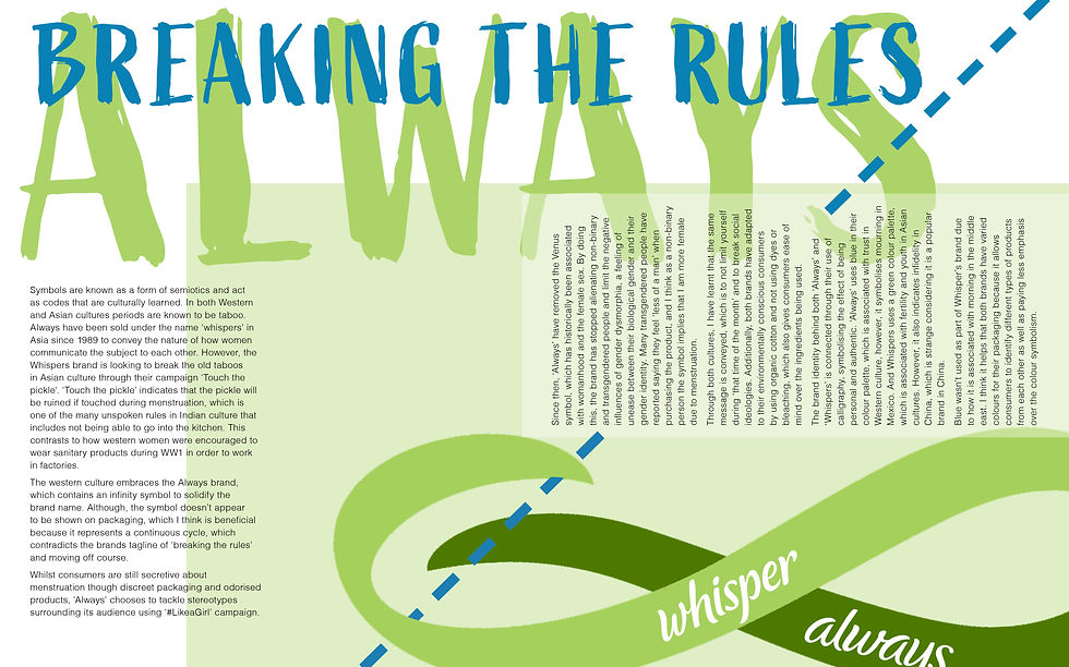
Symbols are known as a form of semiotics and act as codes that are culturally learned. In both Western and Asian cultures periods are known to be taboo. Always have been sold under the name ‘whispers’ in Asia since 1989 to convey the nature of how women communicate the subject to each other. However, the Whispers brand is looking to break the old taboos in Asian culture through their campaign ‘Touch the pickle’. ‘Touch the pickle’ indicates that the pickle will be ruined if touched during menstruation, which is one of the many unspoken rules in Indian culture that includes not being able to go into the kitchen. This contrasts to how western women were encouraged to wear sanitary products during WW1 in order to work in factories.
The western culture embraces the Always brand, which contains an infinity symbol to solidify the brand name. Although, the symbol doesn’t appear to be shown on packaging, which I think is beneficial because it represents a continuous cycle, which contradicts the brands tagline of ‘breaking the rules’ and moving off course.
Whilst consumers are still secretive about menstruation though discreet packaging and odorised products, ‘Always’ chooses to tackle stereotypes surrounding its audience using ‘#LikeaGirl’ campaign. Since then, ‘Always’ have removed the Venus symbol, which has historically been associated with womanhood and the female sex. By doing this, the brand has stopped alienating non-binary and transgendered people and limit the negative influences of gender dysmorphia, a feeling of unease between their biological gender and their gender identity. Many transgendered people have reported saying they feel ‘less of a man’ when purchasing the product, and I think as a non-binary person the symbol implies that I am more female due to menstruation.
Through both cultures, I have learnt that the same message is conveyed, which is to not limit yourself during ‘that time of the month’ and to break social ideologies. Additionally, both brands have adapted to their environmentally conscious consumers by using organic cotton and not using dyes or bleaching, which also gives consumers ease of mind over the ingredients being used.
The brand identity behind both ‘Always’ and ‘Whispers’ is connected through their use of calligraphy, symbolising the effect of being personal and authentic. ‘Always’ uses blue in their colour palette, which is associated with trust in Western culture, however, it symbolises mourning in Mexico. And Whispers uses a green colour palette, which is associated with fertility and youth in Asian cultures. However, it also indicates infidelity in China, which is strange considering it is a popular brand in China. Blue wasn’t used as part of Whisper’s brand due to how it is associated with morning in the middle east. I think it helps that both brands have varied colours for their packaging because it allows consumers to identify different types of products from each other as well as paying less emphasis over the colour symbolism.
Development

I have used the infinity symbol because it is used in both brands and I wanted to break this symbol in order to represent how the cycle of old social ideologies have been broken. For the bottom left, I wanted to turn these symbols into exclammation marks, which ended up looking like medals. For the bottom right, I changed the type to rough lettering to convey a sense of activism and to suit the brand's calligraphy.

I wanted to do a similar layout to David Carson's work to visually show how the rules have been broken. The bottom right has a scissor line to make it clearer that the infinity symbol has been cut or broken.
I got rid of the comma so the text was more aligned and it wouldn't clash with the scissor lines. The scissor lines have been turned blue to bring balance to the piece and blend in with the other layers.

I decided the reduce the size by 10% so there is enough negative space to make the peace feel less overwhelming.
FEEDBACK //
Typography title is good. Layering is good. Effective slice effect
Text set on side difficult to interact with
Needs to be read like you would a pad packet
Pickles were funny - maybe use it for comedy. Not keen on title overlapping. Wasn't clear what there was scissor line - maybe include real scissors
DISCUSSION //

REFLECTION //
This week's webinar mentioned how we have all developed throughout the module so far, which led me to reflect on my lack of research during my undergraduate and the first four weeks of this course. I feel that I have started exploring a lot more designers, which has made a large influence in my creative process. But I also surprised myself during these past few weeks as I have referenced pieces of work that I had thought were completely forgotten about (some as far back as 7 years ago), which have also subconsciously used to inspire my work. I think this might be due to how I have developed methods to reduce stress such as knitting because stress has negative affects on memory. I dislike research, but I think through this course it has become easier to drift away into subjects that interest me and inspire ideas.
Talking about the next module makes me slightly worried because it will focus on the development and crafting process, which has always been my weak point; however, I will focus on next week's hand-in and continue to ask for help. That's another point, I have also learnt to ask for feedback through this module because I used to get tongue-tied, forget what I wanted to say or convince myself that everyone wants to get through a lecture fast, thus, resulting in under-explained concepts.
I think recording my thoughts on this blog has made it easier because everything is in one place and you can rearrange or add to it. Although, the first few weeks were difficult due to adjusting to a new way of recording thoughts as well as figuring out how to create a good narrative for my creative process.
I found Patrick's work very interesting because of how much the project has developed within the two years, and how it allows people to express themselves as well as making sure that everyone doesn't restrict themselves from one-sided news feed. In hindsight, I probably should have chosen the option to look at different news stories in the world, however, I think learning about the social side of a brand in different cultures is also interesting.
I enjoyed finding out about how 'Always' has adapted its use of symbolism to fit with different cultures, taking away the Venus symbol in particular was an exciting topic due to how it is closely linked to my own gender identity. It was however out of my comfort zone to deliberately go against the design principles, so I would have liked to experiment more with the layout if I had more time.
REFERENCES //
https://www.vam.ac.uk/event/VW1qELW8/ldf-2018-breaking-news-2-0
2020 Netflix Documentary, 'Social Dilemma' by Jeff Orlowski.
Design literacy; understanding graphic design. Steven Heller. Allworth Press.
http://www.eyemagazine.com/feature/article/writing-on-the-wall
Visible Signs: An Introduction to Semiotics in the Visual Arts. Crow, David. Ava Publishing, 2010.
https://www.theguardian.com/lifeandstyle/womens-blog/2016/aug/27/why-chinese-women-dont-use-tampons
https://www.linkedin.com/pulse/what-pg-got-wrong-naming-whisper-subhasis-ghosal/
https://helloclue.com/articles/culture/a-short-history-of-modern-menstrual-products
https://www.chinadaily.com.cn/a/201802/23/WS5a8f8862a3106e7dcc13d9b0.html
https://always.com/en-us/about-us/what-ingredients-are-in-always-pads
https://www.youthkiawaaz.com/2014/07/heres-whisper-asking-girls-touch-pickle-periods/
https://www.onetribeapparel.com/blogs/pai/meaning-of-infinity-symbol
https://www.shutterstock.com/blog/color-symbolism-and-meanings-around-the-world
https://k-international.com/blog/color-meanings-around-the-world/


Comments